

Charts & Visualizations in Kommon Poll
Use Kommon Poll chart categories and chart controls to analyze mentions, reach, sentiment, topics, authors, demographics, and competitors.


Kommon Poll offers a rich set of charts and visual tools designed to help you analyze mentions, sentiment, demographics, authors, platforms, competitors, and more. The following guide summarises all chart categories and interaction features based strictly on the provided document.
4.2.1 Main Chart Types
1. Mention Trend & Count Charts
These charts show how frequently your brand or keyword is being mentioned, helping you identify peak activity periods and platform contributions.
Includes:
- Graph of Mention Count: Timeline showing fluctuations in total mentions.
- Social Mention Count Chart: Mentions from social platforms only.
- Non-Social Mention Count Chart: Mentions from blogs, news sites, and websites.
- Mentions by Source (Pie Chart): Breakdown of mentions by platform.
- Mentions by Source Over Time: Multi-line chart showing platform-wise trends over a selected period.
- Mention Time Distribution Heatmap: Highlights the days and time intervals when mentions are most active.
2. Influence & Reach Charts
These charts help you understand how impactful and far-reaching the conversations are.
Includes:
- Influence Score Trend: Shows how influence fluctuates over the selected period.
- Average Influence Score: Mean influence generated per mention.
- Social Reach Graph: Displays changes in estimated audience reach.
- Average Social Reach: Indicates the average reach per mention.
3. Sentiment Analysis Charts
These charts reveal emotional tone, polarity, and subjectivity trends.
Includes:
- Sentiment Polarity Chart: Shows the polarity score with minimum, maximum, and median values.
- Sentiment Subjectivity Chart: Displays subjectivity score details and trends.
- Sentiment Subjectivity Over Time: Shows how opinionated mentions are across the timeline.
- Sentiment Trends by Source: Compares sentiment patterns across platforms.
- Sentiment Distribution Bubble Chart: Shows polarity, subjectivity, and influence through bubble sizes.
- Overall Sentiment Count Chart: Shows positive, neutral, and negative sentiment distribution.
4. Topic, Keyword, Hashtag & Emoji Charts
These charts highlight key themes, expressions, hashtags, and widely used entities.
Includes:
- Emoji Word Cloud: Displays frequently used emojis based on their frequency.
- Emoji Frequency Chart: Shows emoji usage trends.
- Hashtag Word Cloud: Shows the most popular hashtags.
- Hashtag Analysis Charts: Visualizes performance of hashtags by mentions or influence.
- Key Phrases Word Cloud: Highlights frequently appearing key phrases.
- Named Entity Charts: Lists key persons, locations, companies, events, and products.
5. Author & Domain Charts
These charts help identify key contributors and content sources.
Includes:
- Authors Pie Chart: Shows mention or influence share by each author.
- Selective Authors Chart: Displays influence or mentions for selected authors.
- Authors Table: Sortable and searchable table of author metrics.
- Active Domains Count: Number of web domains contributing to mentions.
6. Demographic Charts
These charts reveal geographic and audience characteristics behind the mentions.
Includes:
- Mention Heatmap: Shows geographic distribution of mentions.
- Polarity Heatmap: Displays sentiment polarity across regions.
- Country of Mention Doughnut Chart: Shows mention share by country.
- Sentiment by Country Bar Chart: Shows positive or negative sentiment per country.
- Nationalities Pie & Bar Charts
- Languages Pie & Bar Charts
- Business vs Individuals Pie & Bar Charts
- Population Pyramid (Age & Gender): Visual age and gender distribution.
- Education Distribution & Sentiment by Education Charts
- Job Types Distribution & Sentiment Charts
- Income Distribution & Sentiment Charts
- Job Rank Pie & Bar Charts
7. Competitor Analysis Charts
These charts compare your performance with competitors.
Includes:
- Competitor Mention Count Trend: Shows number of mentions for each competitor.
- Competitor Influence Score Trend: Displays influence changes.
- Competitor Social Reach Trend: Shows audience exposure per competitor.
- Competitor Sentiment Bubble Chart: Shows polarity, subjectivity, and sentiment share.
- Platform Mention Distribution Chart: Displays platform-wise engagement.
4.2.2 Chart Interaction Features
These tools appear on most Kommon Poll charts.
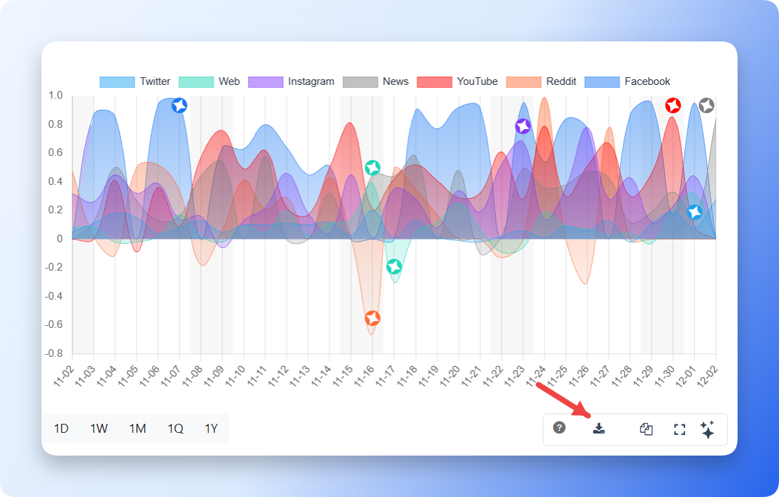
1. Download Button
Saves the chart as an image for offline analysis, reports, or presentations.
2. Copy Button
Copies the chart to your clipboard, allowing pasting into documents or slides.

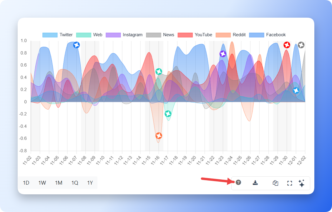
3. Info Button
Provides additional details, definitions, or metric explanations related to the chart.
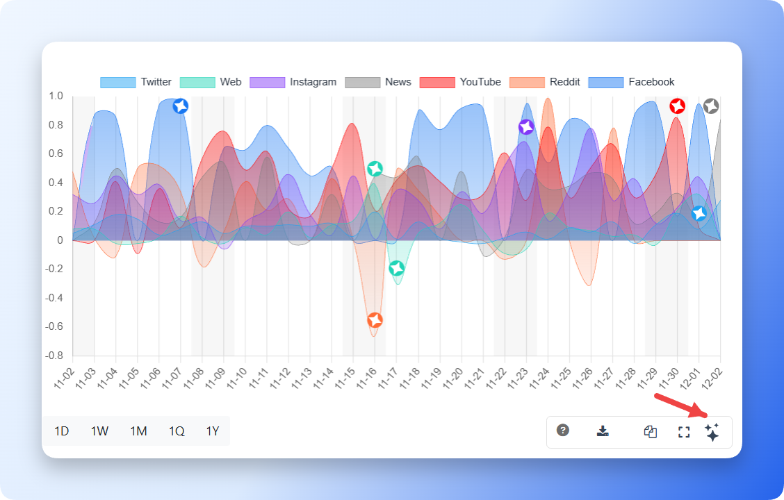
4. Kommon Poll AI Insight Button
Highlights important dates, significant changes, and provides automated summaries. This feature offers AI-generated insights to help users interpret the chart without manually analyzing every detail.
Summary
Kommon Poll includes a wide range of charts covering mentions, sentiment, demographics, author activity, and competitor analysis. Each chart provides valuable insights into brand visibility, public perception, and audience behavior. Interactive tools such as Download, Copy, Info, and Kommon Poll AI Insight enhance the user experience by offering quick access to explanatory notes, export options, and automated insights, making data interpretation more intuitive and efficient.